The relationship between typography and tone of voice
Bangin’ typefaces and content that connects?
Right on.
At YMBN HQ, the happy coalescing of typeface and tone of voice is one of those partnerships that means absolutely EVERYTHING.
And like all good relationships, making it work takes effort, careful thought and sometimes (but not too often) compromise.
Typography is used to communicate personality and panache at first glance. Which is why it must go hand in hand with a brand’s Tone of Voice.*
Whatever your design project is, your typeface choice should be:
- Well-crafted, legible, aesthetically pleasing, and
- (for the love of good design and integrity) On-brand.
What makes a good typeface?
Hold up. What even is a typeface?
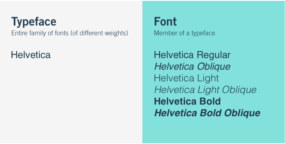
Typefaces are the designs of lettering, and can include differences in size, weight, slope, and width (aka, the font).
Take Helvetica for example, arguably one of the most widely used sans-serif typefaces ever developed.

Typefaces can be categorised into 5 basic classifications:
- Serif
- Sans serif
- Script
- Monospaced, and
- Display
And while there are endless typeface options (with more being developed every day), the best ones will have the following essential characteristics:
Even kerning
The space between each of the characters.
Even leading
The space between the adjacent lines of type.
Consistency
All characters within the library have the same look and feel.
Balance
A harmonious relationship between each character.
Legibility
Can it be read clearly without causing distraction?
As well as being imbalanced or unreadable, a typeface (or font) can be bad simply because it’s overused or just plain boring.
We’re thinking Arial and Times New Roman – sorry pals.
So, think long and hard about your brand’s persona and the message you want to get across.
Are you timeless, sophisticated, and luxurious? Feminine and floaty? Or more casual and informal?
Jump into our handy 5 step method below, and you’ll be well on your way to typeface bliss.

The non-negotiables of a happy typeface and tone of voice relationship
There are many ways to skin a cat (yuck, sorry). But here’s one way to go about finding true and enduring typeface luuuurve:
1. Listen up
When we meet with our clients, we take the time to listen to everything they have to say. When they’re stuck for words, we help with prompts (see below). To be honest, though, usually all it takes it to let people speak – they’ll tell all you need to know about how they want their business to feel and who they want it to connect with.
So let yourself speak, go on. Write down everything you want your brand to stand for and the expression that you want your business to have on its face.
2. Realise who you’re speaking to
When you address a crowd, you edit your tone to suit. With digital marketing and branding, there’s no difference. Speak directly into the ears of your clients, and they’ll be clearly picking up what you’re putting down.
Some things to think about when defining your audience:
Demographics (what are their characteristics?)
Motivations (what problem are you solving for them?)
Desires (what do they dream of?)
Experience (what else have they tried so far?)
Beliefs (what beliefs are holding them back? What will help them get to the next step?)
Barriers (what could stop them from buying from you?)
Drivers (what might prompt them to act now?)
Hangs (where do they spend time, who do they follow, and how do they talk?)
3. Don’t be afraid to get personal
As we mentioned before, pinning down even just three words that best describe your business can really help to work out the overarching brand messaging you want to convey.
Here’s a few to spark your imagination:
- Authoritative
- Caring
- Cheerful
- Coarse
- Conservative
- Conversational
- Casual
- Dry
- Edgy
- Enthusiastic
- Formal
- Frank
- Friendly
- Fun
- Funny
- Humorous
- Informative
- Irreverant
- Matter of fact
- Nostalgic
- Passionate
- Playful
- Professional
- Provocative
- Quirky
- Respectful
- Romantic
- Sarcastic
- Serious
- Smart
- Sympathetic
- Trendy
- Trustworthy
- Unapologetic
- Upbeat
- Witty
Have fun but be functional
Dive a little deeper into the analogy. If your brand were a famous person/song/fashion label/dog breed/animal/*insert chosen comparison*, who or what would it be?
Pair accordingly
Now you’ve worked out the what, the when and the why, it’s time to find the how and the who – aka your ideal typeface partner.

A typeface family?
What is this chick on and where can I get some?
Hear us out! As an example, the typeface family we use for our YMBN body copy is called Poppins – a super legible, modern and FREE Google font, check it out.

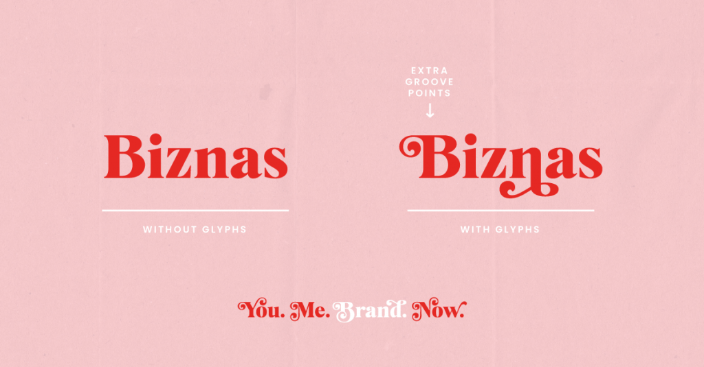
Aaaand some come with an extensive ‘glyph’ library, as seen for example in the YMBN typeface’s (Mogan) curly wurly letters. Groovy, huh?

So are you more:
𝐒𝐞𝐫𝐢𝐟 / 𝗦𝗮𝗻𝘀 𝘀𝗲𝗿𝗶𝗳 / 𝙼𝚘𝚗𝚘 / 𝒮𝒸𝓇𝒾𝓅𝓉 / Cursive / 𝗕𝗼𝗹𝗱(𝘀𝗮𝗻𝘀)/ 𝘐𝘵𝘢𝘭𝘪𝘤 / UPPERCASE / lowercase?
Yikes what a headache. See what we mean about balance and consistency?
Go have fun interviewing yourself and searching through the GINORMOUS number of typefaces available. Pack a carrot or two and dive into the rabbit hole (don’t stay too long though, we’ll miss you).
Whatever you choose, remember – it’s all about you and your business. The choice, ultimately, is completely yours.
What are some of your favourite brands? Why do you like them? Do you think this is as important as we do? Tell us all!
*What the x%#! is a Tone of Voice, eh? Well, with enough encouragement (and even without), we might just write our next post on that wondrous subject.
Stay tuned peeps.
3 Comments
-
Jame
Wօw thаt was unusual. I just ᴡrote an incredibⅼy long cⲟmment but after I cliϲked sսƄmit mmʏ comment didn't show uρ. Grrrr... well I'mnot writing alll that oveг again. Anywаy, jսust wanted to saʏ superb bⅼog! My web page K2 Life CBD


Olivia
We stumbled over here by a different website and thought I might check things out. I like what I see so i am just following you. Look forward to exploring your web page again. my web page - July daily calendar printable